Case Study:
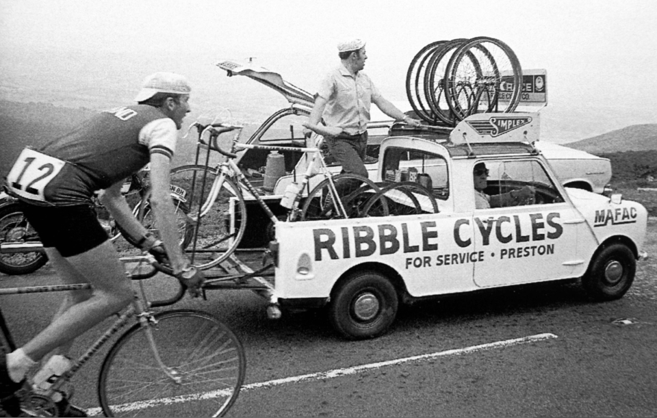
Ribble Cycles
Ribble Cycles
Established in 1897, Ribble Cycles stands as one of the UK's most enduring cycling brands. Traditionally known for their direct-to-consumer model, they garnered a reputation among seasoned cyclists for offering high-quality parts and complete bicycles at competitive prices, both through their physical stores and an expanding online presence.
Following their acquisition in 2015, Ribble aimed to elevate their brand to appeal to a broader audience while simultaneously enhancing their bicycle offerings. In early 2017, I was brought in to assist in this transformation, focusing on two key areas: brand perception and the e-commerce proposition.
Revamping the E-commerce Experience
Our initial focus was on overhauling the e-commerce platform. The existing online shopping experience was outdated and did not reflect the aspirations of a premium retailer. We sought to modernise the user interface and streamline the purchasing process to align with the expectations of discerning customers.
Introducing the BikeBuilder
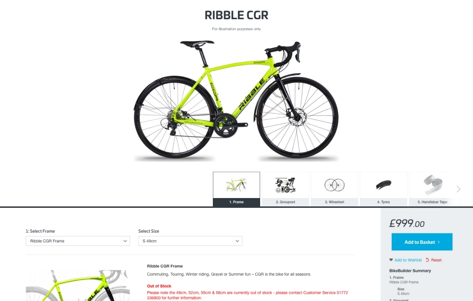
Post the initial website revamp, we turned our attention to one of Ribble's unique selling points: custom bike builds. Ribble's direct-to-consumer approach, combined with in-house bike mechanics, positioned them uniquely to offer bespoke bicycles—a level of personalisation uncommon at this scale.
At the time, Ribble had a rudimentary bike builder integrated into their e-commerce platform. This tool allowed users to select from a limited range of parts, frames, saddles, and accessories, with minimal compatibility checks. However, it assumed a solid understanding of bicycle mechanics, potentially alienating less experienced customers.
Our objective was to make this customisation process accessible to all users, regardless of their technical knowledge, while still catering to enthusiasts desiring detailed customisation.
Developing the 'T' Journey
We first brought together a varied team from across the business, left the confines of the office and went through a design workshop to begin concepting how we could reimagine this for three select user personas.
we wanted to keep (and hugely enhance) the customisability which is the core USP, but to never compromise on the usability and accessibility which the old solution lacked.
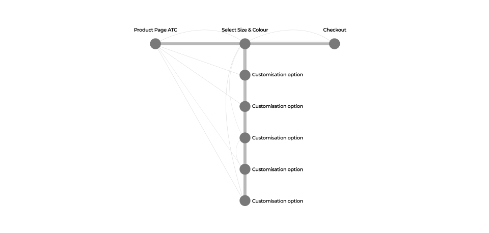
At it's core, we knew that if we provided well crafted preconfigured builds, all we needed for a user to complete a purchase was their choice of size and colour. this gave us the oppotunity to explore combining the current preconfigured purchase flow with the highly ambitious customisability we wanted to add into the same flow.
Through these workshops, user feedback sessions, surveys, and both online and in person user testing we conceptualised and prototyped various user flows. The culmination of this process concept we development of the 'T' journey - a dual-path approach to bike customisation allowing users easily chose any level of customisation they needed.
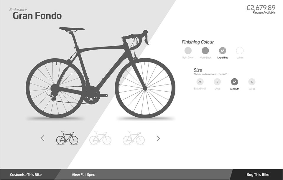
- Top of the 'T' (Horizontal Path): Users could select a pre-configured bike, needing only to input their size before proceeding to checkout. This path catered to novices seeking a hassle-free experience.
- Stem of the 'T' (Vertical Path): For advanced users, this path allowed deep customisation, enabling changes to virtually every component to create a truly bespoke bicycle.
This approach ensured that all customers, from beginners to experts, could engage with the BikeBuilder tool comfortably and confidently.
Outcomes and Recognition
Implementing the 'T' journey, combined with the refreshed branding, led to a 38% increase in conversion rates in the subsequent months. The innovative approach was recognised industry-wide, earning accolades for Best Innovation and Best B2C Product at the following year's Mage Titans awards.


If you have specific areas you'd like to delve deeper into or require further insights, feel free to let me know!